Giving the Staff Faces
Thirty-four painted staff portraits, a male and a female version for every profession, regional names and short quotes in four languages. Plus a new app icon and a rule about when not to show the crystal button.
After staff replaced managers, every person needed a face. Not one per person (that would be over a hundred portraits), but one per profession: lift helper, lift attendant, hut host, ski technician, canteen chef, ski instructor, shift lead, operations manager, director and the specialists of the regional businesses, from bath attendant to heli pilot.
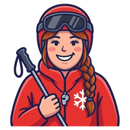
Two variants of everything
Each region has its own people with regional names, and many of them are women. So each profession needed two versions. The workflow that worked best: paint the male version first, then create the female version as an edit of that image, with the same pose, uniform and framing, but each woman with her own hair colour and style. That keeps the pairs consistent without making them copies.
Some notes from the session:
- The shift lead "looks too much like a police officer". The uniform needed to be friendlier.
- The female director got grey hair, to match the experience of the role.
- The skis of the instructor looked like old straight skis. Modern skiers expect wider all-round carving skis.
- One olive-green jacket simply did not work next to the rest of the palette.
I also asked how much space it would save to have only one version per role. The answer: a few hundred kilobytes for the whole set. Not worth giving up half of the characters.
Names and quotes
The staff list is a small table: region, business, role, name and a quote. Austria has a Ferdl at the platter lift ("The first lift in the morning is always something special") and a Hias at the T-bar ("Get on calmly, the lift does the rest"). Italy, France, Canada, Japan and Switzerland have their own names, and the quotes have a gentle regional flavour without turning into clichés.
Names are never translated. Roles and quotes are translated into every language, and the game refuses to start in development if a person has no text in some language. That check caught several gaps when Italian and French arrived later.
Repainting the beginning
Looking at the first screen with fresh eyes, the first businesses were the dullest: a grey hut and a pale single chairlift. The first minutes decide whether someone keeps playing, so these two were repainted with more colour and life. I also swapped the order of the hut and the T-bar, so the first row of businesses alternates between lift and building instead of lift, lift, building. Small change, much livelier screen.
The T-bar icon itself went through several rounds. Its red bar became bigger and more iconic, the spring housing less dominant, and in the end two versions were merged by hand because neither alone was right.
A new app icon
The first app icon was technically correct and visually forgettable. The new one is painted: a red gondola cabin with a gold coin against a sky gradient. It is split into the layers Android expects for adaptive icons (background, foreground, monochrome for themed icons), and the same source produces the 512 × 512 Play Store icon and the web icons.
When not to show the crystal button
One design rule came out of this day that I like a lot. The very first expansion (Silberkamm's family area) offered the option to finish the build instantly with crystals. But at that point the player has never seen a crystal and does not know what they are. A button that uses an unknown currency is noise at best and confusing at worst.
So on the very first build, the crystal option is hidden. Crystals are introduced later, in their own moment, and only after that does the button appear. Teaching one new thing at a time sounds obvious, but it took a while to see where the game was teaching two.